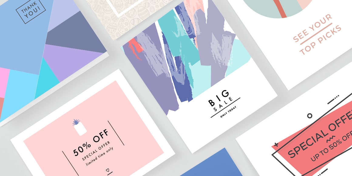
Designing a direct mailpiece presents a different challenge than creating an email design or a social media post: it’s a single printed piece that has to tell enough of a story to drive a consumer online or in-store without a clickable direct link. So it’s vital that a piece captivates quickly with a professional look and standout messaging.
We spoke with Rene Bonin, Creative Director at Amplified Mail, about the basic principles of designing a mailpiece. He shared six standout tips for creating a piece that delivers results.
Understand Your Audience 1
Direct mail is a unique form of advertising that comes with a captive audience—from the mailbox to the front door. Before you start designing your piece, Bonin suggests taking time to understand who you are targeting and what emotion you want to evoke from them.
“Consider what an entire audience may gravitate toward, not just what you like.”
For example, a luxury car brand may send a sleek postcard with limited copy to convey an aspirational feeling to potential customers. A local veterinarian might use cute pictures of puppies and kittens to encourage pet owners to bring theirs in for a checkup.
Less Is More 2
According to Bonin, you have only a few seconds to grab a person’s attention, so avoid clutter. If you try to say too much or include too many different images, it becomes difficult for consumers to know what to respond to. Instead, have a primary message and let the entire piece drive that home.
“Don’t feel compelled to fill every corner to get your money’s worth. You can be heard a lot louder by whispering than by shouting.”
As you’re designing, Bonin suggests that you think aesthetically. Experiment with drop shadow to set primary text apart from the rest. Make background images lighter or more transparent so that your copy isn’t lost in dark colors or harsh lines. Keep messages short and to the point.

Make It Flow 3
In addition to keeping messages concise and decluttered, make sure that things flow visually. Using standard grid lines to keep items aligned and well-spaced goes a long way toward creating a highly readable piece.
A consistent visual flow stops people’s eyes from bouncing around. Use a clean hierarchy of weights (such as light, regular and bold) and font sizes—rather than using many fonts in different weights and styles—to guide a reader through your message. Rather than cluttering space with photos and graphics that have varying treatments, choose one or two that convey emotion best and are cleanly lined up.
Have a Strong (But Simple) Message 4
Once you know the reason you’re sending a direct mailpiece and the emotion you want it to evoke, you can start thinking about messaging. Keep it short and punchy, Bonin suggests.
“Nothing works better than when an image and a strong headline come together and become one.”
Rather than telling your entire brand story in the space of a postcard, find a few captivating lines that focus on the campaign at hand and encourage some kind of action, like coming into the store or making an order.
Bonin also cautions against overused, punny lines (think “Patty-O-Furniture” sales around St. Patrick’s Day) or spending too much time highlighting accolades. If it doesn’t show a consumer how your product or service can improve their life, keep it off the mailpiece.
Stay Relevant 5
Keep the imagery and messages on your mailpiece relevant to the campaign. You want people to see your piece and know, almost immediately, what your business does—so putting a family pet on a piece for an electronics retailer would be counterintuitive. Similarly, stay away from graphic elements like icons and emojis that don’t serve your message.
“Using irrelevant images puts too much attention on the wrong thing.”Design your campaigns around relevant events or times of year to appeal to your audience’s current needs. Use a strong call to action to create a sense of urgency and drive response rates.

Know Your Limitations 6
If you feel like you’re biting off more than you can chew, you probably are, according to Bonin. Before you start developing your campaign and creating a design, do the research into what type of mail format works for what you’re doing. A multi-panel mailpiece, for instance, requires more effort than a standard postcard. Then, acknowledge if you truly feel comfortable creating the piece yourself.
“If layout and design aren’t your strengths, leave it to a professional—the results will speak for themselves.”
Direct mail, like any marketing, is an investment, so you want to make sure it pays off. Whether doing it yourself, in-house or with a freelance designer, gather samples and develop a clear direction for the piece. If your materials are well prepared, designing a simple and effective postcard shouldn’t take more than a few hours, Bonin says.
Key Takeaway
When you’re ready to create your mailpiece, let these principles guide the way. With concise messaging and relevant images, you’ll make a piece that flows and attracts attention. Even better, your piece could convert prospects into customers.